Box and Whisker Plot Explained: Definition, Interpretation, and Examples
In the world of statistics and data visualization, the box and whisker plot, also known as the box plot, stands as a powerful tool for summarizing and understanding the distribution of a dataset. Whether you’re a student grappling with your first statistics course or a seasoned data analyst deciphering complex datasets, mastering the art of interpreting box plots can unlock valuable insights and inform data-driven decisions. In this blog, we’ll delve into the definition, interpretation, and examples of box and whisker plots to demystify this essential statistical technique.
What is a Box and Whisker Plot?
A box and whisker plot is a graphical representation of the distribution of a dataset through five summary statistics a shown in the figure below:
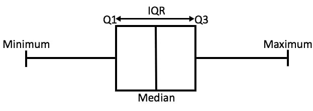
Visually, it comprises a rectangular “box” and two “whiskers” extending from either end of the box. The box encapsulates the interquartile range (IQR), which spans from the first quartile to the third quartile, while the whiskers represent the range of the data beyond the quartiles. Outliers, if present, are typically depicted as individual points beyond the whiskers.
Functions
Box and whisker plots are widely used in data analysis and statistics for several purposes:
- Summary of Data Distribution: Box plots provide a concise summary of the distribution of a dataset, including measures of central tendency (such as the median) and variability (such as the interquartile range). They offer a visual representation of the spread and shape of the data, making it easier to interpret than raw numerical values.
- Comparison of Groups: Box plots are effective tools for comparing the distributions of different groups or categories within a dataset. By plotting multiple box plots side by side, analysts can visually assess differences in central tendency, spread, and variability between groups, aiding in comparative analysis and hypothesis testing.
- Identification of Outliers: Outliers, or data points that deviate significantly from the rest of the dataset, can have a significant impact on statistical analyses and conclusions. Box plots help identify outliers by visually highlighting data points that fall outside the whiskers, enabling analysts to investigate potential anomalies and assess their impact on the overall dataset.
- Detection of Skewness and Symmetry: Box plots can reveal patterns of skewness or symmetry in the distribution of data. A symmetrical distribution will have a box plot where the median line is approximately centered within the box, while skewed distributions will have the median line shifted towards one end of the box. This information is valuable for understanding the underlying characteristics of the data and selecting appropriate statistical methods for analysis.
- Visualization of Variability: Box plots provide a clear visualization of the variability within a dataset, as indicated by the length of the whiskers and the size of the box. Larger variability is represented by longer whiskers, while smaller variability is indicated by shorter whiskers. Understanding variability is crucial for assessing the reliability and stability of data measurements.
- Monitoring Process Performance: In quality control and process improvement applications, box plots are used to monitor the performance of manufacturing processes or system outputs over time. By plotting key process metrics on box plots at regular intervals, analysts can identify shifts, trends, or abnormalities in the process performance, facilitating timely intervention and corrective action.
Interpreting a Box and Whisker Plot
Now, let’s break down the components of a box and whisker plot and unravel the insights they offer:
- Median (Q2): The line inside the box denotes the median, or the middle value of the dataset when arranged in ascending order. It serves as a measure of central tendency, dividing the data into two equal halves.
- Quartiles (Q1 and Q3): The lower boundary of the box represents the first quartile (Q1), while the upper boundary corresponds to the third quartile (Q3). These quartiles delineate the middle 50% of the data and offer insights into the spread of values around the median.
- Interquartile Range (IQR): The length of the box, spanning from Q1 to Q3, defines the interquartile range (IQR). It encapsulates the central 50% of the dataset and provides a measure of dispersion that is robust against outliers.
- Whiskers: The whiskers extend from the edges of the box to the minimum and maximum values within a predefined range, typically 1.5 times the IQR. They offer a visual representation of the spread of the data beyond the quartiles, highlighting the range of typical values.
- Outliers: Individual data points lying beyond the whiskers are considered outliers and are often depicted as distinct symbols on the plot. These outliers warrant further investigation as they may signify anomalies or errors in the data.
Example
Let’s illustrate the utility of box plots with a few examples:
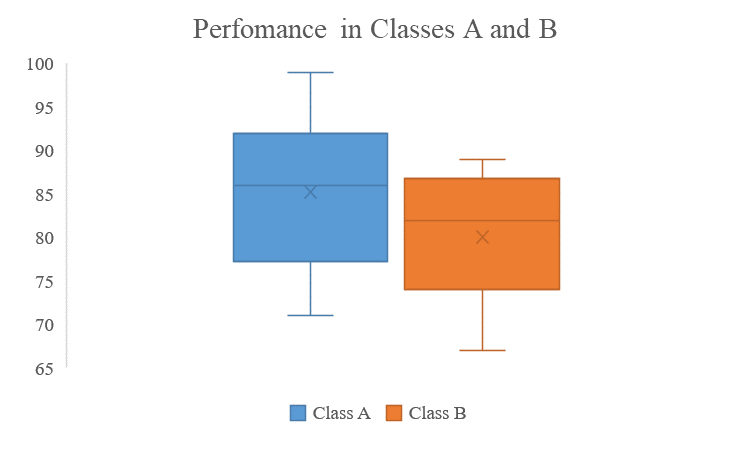
Exam Scores: Suppose we have the exam scores of two classes, Class A and Class B. By comparing the box plots of their scores, we can discern differences in the central tendency, spread, and presence of outliers, offering insights into the performance distribution of the two classes.
consider the data below
Class A: 72, 92, 98, 93, 89, 83, 89, 93, 78, 99, 83, 92, 77, 72, 83, 92, 77, 92, 71, 80
Class B: 88, 81, 69, 80, 89, 76, 74, 87, 85, 89, 71, 74, 86, 83, 75, 72, 67, 87, 85, 83
From this data, we can get the below box and whisker plot
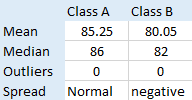
summary of the findings
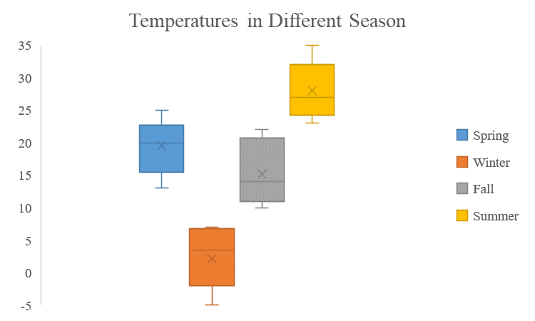
 Temperature Variation: A meteorologist analyzing temperature data over different seasons can use box plots to visualize the variability in temperature distribution. The box plot may reveal seasonal trends, identify extreme temperature outliers, and aid in climate analysis.
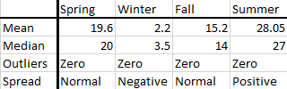
consider the sample data below representing four seasons in a year
Spring: 13, 22, 24, 22, 19, 13, 25, 15, 24, 20, 23, 20, 21, 22, 20, 17, 25, 18, 15, 14
Winter: 2, 7, -2, 4, 5, 7, 7, -5, -3, -4, 7, 5, 6, -1, -4, 7, 1, -2, 3, 4
Fall: 13, 17, 18, 15, 12, 13, 10, 21, 21, 10, 14, 11, 11, 10, 22, 21, 20, 14, 10, 21
Summer: 23, 26, 24, 23, 27, 35, 32, 32, 27, 23, 31, 35, 29, 32, 29, 25, 27, 33, 25, 23
From this data, we can get the below box and whisker plot
The resultant summary results is as shown in the summary below
Conclusion
In summary, the box and whisker plot serves as a versatile and intuitive tool for summarizing the distribution of numerical data. By encapsulating key summary statistics in a visually accessible format, box plots enable researchers, analysts, and decision-makers to glean valuable insights, identify patterns, and detect anomalies within datasets. Whether you’re exploring academic performance, meteorological trends, or financial indicators, mastering the interpretation of box plots empowers you to extract meaningful information and make informed decisions based on data-driven evidence.
Needs help with similar assignment?
We are available 24x7 to deliver the best services and assignment ready within 3-4 hours? Order a custom-written, plagiarism-free paper