Histogram: Definition, Types, Graph, and Examples
A histogram is a graphical representation of data that displays the frequency distribution of a dataset. It consists of a series of adjacent bars, where the height of each bar corresponds to the frequency or relative frequency of occurrences within each interval, also known as a bin.
Definition
A histogram visually represents the distribution of numerical data by dividing it into intervals or bins. It provides a clear picture of the central tendency, variability, and shape of the data. Histograms are widely used in statistics, data analysis, and various fields to understand the distribution patterns of datasets.
A typical histogram graph consists of two axes:
- The X-axis (Horizontal Axis) represents the range of values or intervals of the data.
- The Y-axis (Vertical Axis) represents the frequency, relative frequency, or cumulative frequency.
Each bar in the histogram corresponds to an interval on the X-axis, with the height of the bar indicating the frequency or relative frequency of observations within that interval.
Types and Examples
Frequency Histogram:
This type of histogram displays the frequency of occurrences within each interval. The height of each bar represents the absolute frequency.
Example
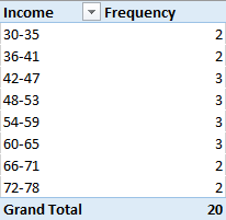
Consider the Income Distribution data in the table below:
![]()
Suppose you have a dataset concerning the income (in $1000) of 20 individuals. The histogram would represent the distribution of income across different income intervals, such as 0–10, 11–20, 21–30, and so on. Therefore, the first step is to create a frequency table before constructing a histogram (in cases where technology is not in use), as shown in the table below
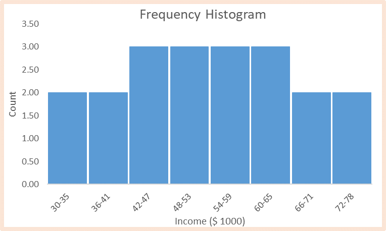
From this point, we can use bar graphs to construct the histogram, with the intervals (income) placed on the x-axis and the frequency on the y-axis. The resultant histogram is shown below.
Relative Frequency Histogram
Instead of showing the absolute frequency, this type of histogram displays the proportion of occurrences within each interval relative to the total number of observations. The height of each bar represents the relative frequency.
Example
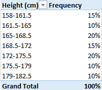
Consider the Height Distribution data in the table below:
![]()
Given such data, you can create a histogram to visualize the distribution of heights across various height intervals (e.g., 150–160 cm, 161–170 cm, etc.). Therefore, the first step is to create a relative frequency table before constructing a histogram (in cases where technology is not in use), as shown in the table below
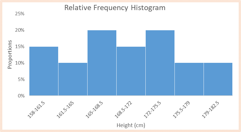
From this point, we can use bar graphs to construct the histogram, with the intervals placed on the x-axis and the height proportions on the y-axis. The resultant histogram is shown below.
Cumulative Frequency Histogram:
In this histogram, each bar represents the cumulative frequency (CF) up to the corresponding interval. It helps visualize the total cumulative frequency distribution as the data progresses.
Example
Consider the exam score distribution data in the table below:
![]()
Given such data, you can create a histogram to visualize the distribution of scores across performance intervals (e.g., 10–20, 20–30, etc.). Therefore, the first step is to create a cumulative frequency table before constructing a histogram (in cases where technology is not in use), as shown in the table below
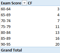
From this point, we can use bar graphs to construct the histogram, with the intervals (exam score) placed on the x-axis and the cumulative frequency on the y-axis. The resultant histogram is shown below.

In summary, histograms offer a powerful way to visually represent and interpret the distribution of data, making it easier to draw insights and make informed decisions in various fields ranging from finance to healthcare and beyond.
Needs help with similar assignment?
We are available 24x7 to deliver the best services and assignment ready within 3-4 hours? Order a custom-written, plagiarism-free paper